To follow my trailer I had to create some advertisement in the form of a poster and a magazine front cover. In this post I will illustrate the procedures I took in order to create a final poster.
First of all I used my previous research and collated the three poster I had already used in my pre – production stage of my project, where I analysed posters of Sinister, Black Swan and The Shinning.


I noticed a running theme on all posters are there is a main image of a character that features in the film, there is some sort of distortion in the genre psychological thriller. Lastly the layout is generic to a typical poster with the main image, credits on the bottom third, and some sort of quotation on the poster (puffs and plugs). To make my poster as best as it can be I had to follow these conventions. I started off with choosing a masthead. In these three examples the name of the movie is the mast head so for my poster I decided my masthead would be ‘Foul Play’ (the name of our movie).
To create this poster I have been using adobe inDesign. I tried to find a font that was effective and that made my poster look professional. However none of them fit my criteria so I decided to go on the internet and use DaFont a website that allows you to create certain fonts.


This website allowed me to chose from a wide range of fonts, I went through all of these font types and came down to a list of my favourites:
I put these in an inDesign document to see if they fit the look I was going for in my poster.
1.
2.
3.
4.
5.
After getting feedback from a few class friends and class lecture I collated responses. The majority said that all the fonts were good for a psychological thriller but they were very generic of the genre. I was told to make find a font that was of psychological thriller based but specific to my trailer so then it is more emphasised. Although from the 5 fonts above the majority of people thought that number 4 was the best out of all of them currently.
In response to this feedback I went back onto daFont and looked for more theatrical/psychological/horror based fonts to fit my trailer. These were the results I got –

I then realised that these didn’t fit my poster either. I wanted something pain but very effective. So I dedicated a few hours to work out how to use photoshop effectively so I could use font’s on the programme and edit them myself to fit my poster.
I began by watching a few YouTube video’s for basic tutorials
This video helped me make custom paint brushes to add effects to my title.
https://www.youtube.com/user/NewWorldOps/playlists
I mainly used this channel as it had plenty of video’s of how to manipulate images which was very important for me creating this poster.
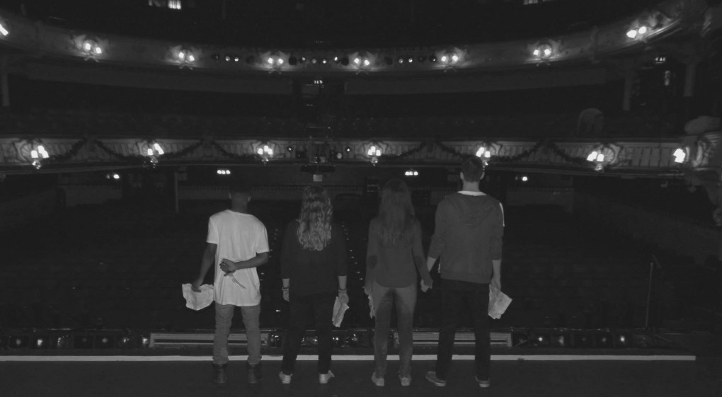
After watching these video’s I began with selecting a main image. This would be my background and after choising this I was under way. Below is the picture I stared with –

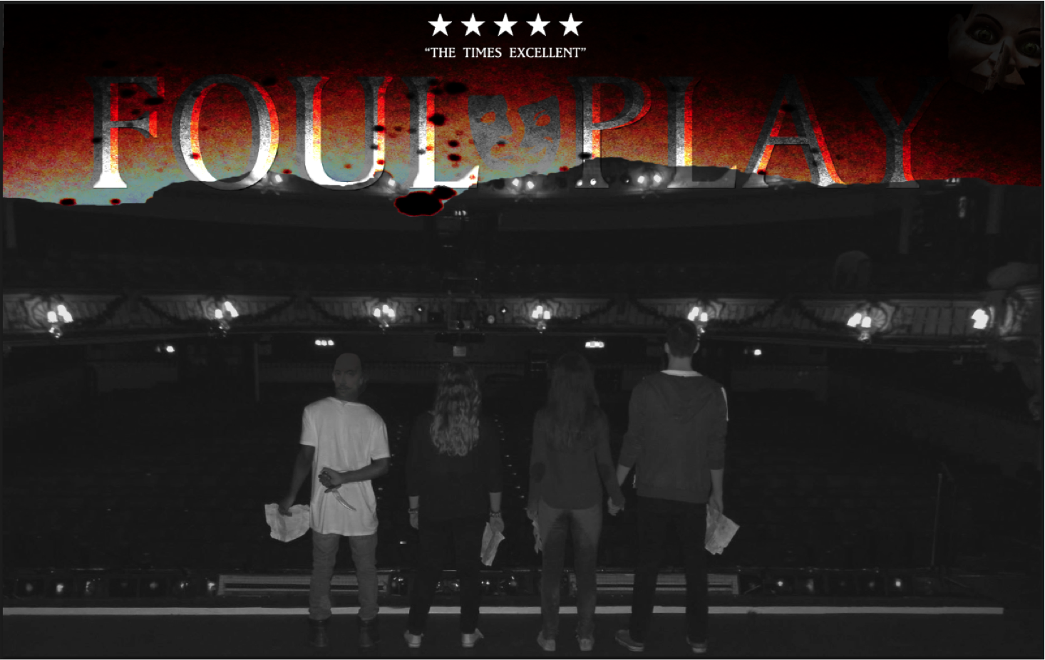
at first I could work out what to do to it then realised I need to work with above the characters and also below.. I stated with adding the heading, from there I added a black strip under the heading to break up the picture to the title. This was the out come –

I then realised there was no horror/psychological implications to emphasis my trailer so I went generic and added some blood. This picture I found on Google.

With this picture I had to edit is so the picture fit with my main image. I done the editing on a different tab. I removed the background (white) and the blood that was on the white to be just left with the dark red edged on the left. The picture below will show

I then had to copy this image and paste it onto of my main image as a layer. This meant I had to scale and rotate this image so it fit properly. I had to also arange my layers so you could still see my title heading.

From there I didn’t like the texture and contrast between the new layer on my main image so I thought to mess around with photoshop and I found an option that allowed me to change the colouring of the blood layer. This was on image > adjustments > curves. A box would appear and I just moved the line around to change the colour of the picture. This made suttle differences but my poster was beginning to take form.

I then realised I didn’t like how the foul play heading contrasted against the rest of the poster so I double clicked the layer and a layer style came up. I could adjust the title to my preference. Again I had to have a little play around until I came to something I liked. I changed the blend mode from normal to saturation. I then copied the layer and made it an overlay. This was the out come.

Most psychological posters have a mystrious hidden picture* so I added this to the corner. Editing this picture I had to select the part of the picture I wanted like I done previously for the blood, then from there I had to adjust the layer style as I did with the header. I decreased the opacity from 100% to 28% making it less visible giving a eerie feel to it. As if it is hiding away. As our trailer is a theatre based trailer I also thought to incorporate generic theatre masks somewhere in the poster and a picture of Shakespeare as he was iconic in our trailer. As a game – spot shakespeare (clue look at the actors) .With the masks I changed the blend mode from normal to saturation to match my title. I found that the best place was in-between the foul and play on the title. Below are the two pictures as originals and how I changed them to fit my poster.


After incorporating these images in my poster I thought I had a finished piece that looked like the picture below. How ever I wanted to maximise my poster and make it the best it could be so I went around the class to get feedback.
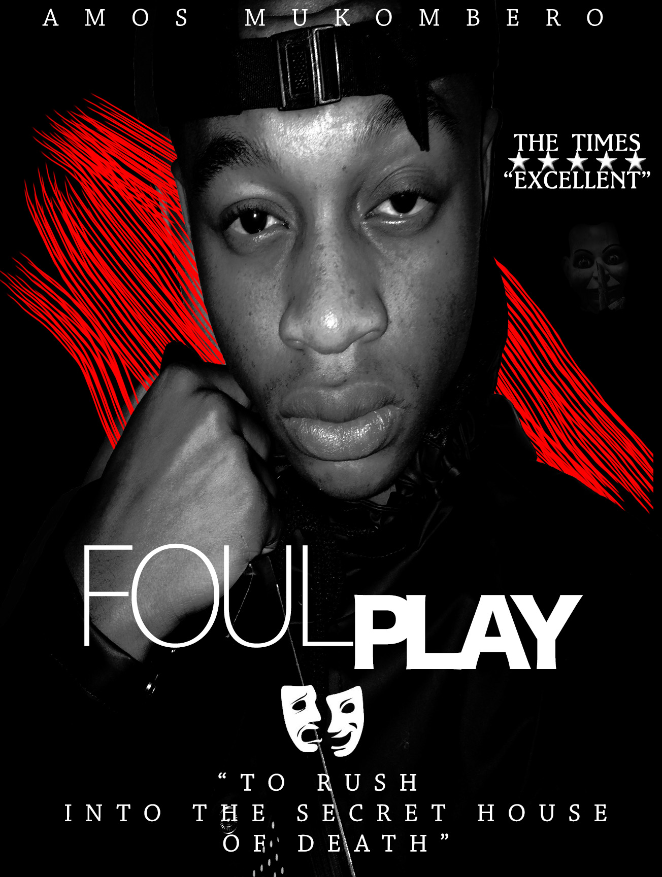
 General feedback I got was I needed to add in some sort of quote, I needed credits. I needed to lose the Shakespeare on one of the characters faces as it doesn’t work. Other feedback I got was I need to change the main image and make it more audience engaging, there are no focal points within the poster and this is important for a poster to lure in the audience. Also they said they liked the editing of the header, it seemed as if a lot of time was spent on it so they credited me for that. They also liked the picture in the top right hand corner as it illustrates the genre more. The rating and the theatre masks were also aspect that my class mates liked. To this response my group and I got new pictures they are below.
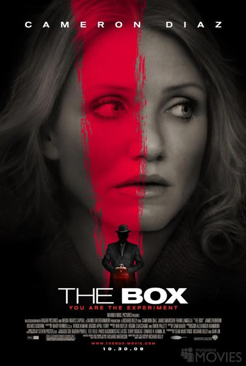
As these pictures were facial based I done some more research on posters that had a main image of a face to get inspiration from these are a few:

![salt-2[1]](https://amosmukomberoa2media.wordpress.com/wp-content/uploads/2015/02/salt-21.jpg)
I then kept picture in the top right hand corner, the masks and the rating. Although I reconstructed the title as you can see. And it started to look like this:

From the examples they all have the main actors name above the main image so I decided to add that to mine. I also decided I want to include another colour to the poster and the quote in response to the feedback I received. This was the outcome of all of these changes. The quote I obtained from doing a google search of ‘famous shakespeare quotes about death.
For this movie poster I went on Facebook (a public social networking site) so that I could get general feedback from the public here is the feedback that I received:
![]() this was the post I wrote prior the feedback.
this was the post I wrote prior the feedback.


After the feedback I received I reconstructed my poster changing around the playing with the advise I received. An aspect I didn’t include was the mask picture, this was because I found it on another publication that was not my own and including it would have meant that I was breaching copyright rules. Aspects I decided to add on top of the feedback were social networking information on the bottom of the poster, this included the twitter hashtag #FoulPlay and the @FilmFoulPlay for Facebook and Instagram. This would embrace advertising for the movie.

For the cracking affect on the face, and titles I used the lasso and quick selection tool to select the piece I wanted to crack and I then clicked ono the move tool to move the selected part from the original image giving a cracking affect. This also worked for the titles.
The fonts I used to create my final poster were Baskerville
Market Synergy
I used the same ‘Foul Play’ title image on the poster as on my magazine to incorporate a synergy. The style of my magazine with a black back ground with a black and white image is also synergy. I also used the same colour scheme of white, red and black to keep the market synergy a constant theme through my work.
*To export all Photoshop documents you have to change the file format from PSD to JPEG as this is a generic file format.
