In this post I will be illustrating the processes I took in order to complete my magazine. To start of with I used needed to do some research on magazines and layouts. I realised this was a main focus on my AS Media Coursework last year so I visited my old blog and used some of the research I had already collected. This has saved me a great deal of time!
Magazine Conventions
When constructing my magazine features I will need to include so my magazine front cover is generic are the following:
- A banner (promotional features are an option)
- Masthead (usually the name the magazine)
- Main image (so people can have a tease of what content the magazine will feature)
- Cover lines
- Strap lines
- Footers
- Barcode
- Price
- website
- serif font
- A clear colour scheme
- Issue number and date
Banners and mastheads are usually positioned horizontally on the top third of the magazine. Headlines and cover lines are usually positioned on the left third of the magazine so if the magazine is covered by other magazines the audience can see the main stories quickly by only seeing a third of the magazines. The barcode is usually found on the bottom right of the magazine. The image is always in the middle of the magazine left of right third; depending on the image size and the editors preference. The purpose of this is to grab the audiences focus.
The above is my primary research from last year. Although last year I designed a music magazine the layout and conventions would be the same for all genre magazines.
I will now collate a few examples of current horror movie magazines that are out there already so I can have examples to work from.


I started the process last time with making a flat plan so that’s how I started again this year as it is good for guidance. Below is a flat plan of the layout of my magazine front cover.

For the actual creation of my magazine I used the programme Adobe Photoshop. I was an amateur at using the programme so I watched a few youtube video’s to guide me thought the basic features of the program. The videos I watched are as follows.
Every magazine needs a Masthead so that is what i started with when making my magazine. I decided to call my magazine ‘envy film’ because I want the audience to be ‘envious’ towards the stars that feature in the magazine. I want them to gain inspiration just from reading the stories inside. I added ‘film’ to the name to emphasise the genre of magazine it is. Here are the steps I took to create my masthead.
Masthead stage 1.

Masthead stage 2

Masthead stage 3

Masthead stage 4

From here them began to construct some generic magazine storylines that would entice the readers, I also added puffs and pugs with competitions on them. I inserted a strap line on the top and the bottom of the magazine and I also inserted a barcode. This was my first draft. However I know I need to include a main image so this will be my next focal point. 
The picture below I added a main image on my magazine. It is of the main character in the film. This is the synergy to my poster and film trailer. As before I didn’t have a main image I couldn’t see the spacing betweeen my masthead and the main image, so here I have removed the FILM and the stars below the mast head ‘ENVY’ as it was an element that didn’t work.

For this magazine front cover I went on Facebook (a public social networking site) so that I could get general feedback from the public here is the feedback that I received:
![]()
this was the post I wrote prior the feedback.
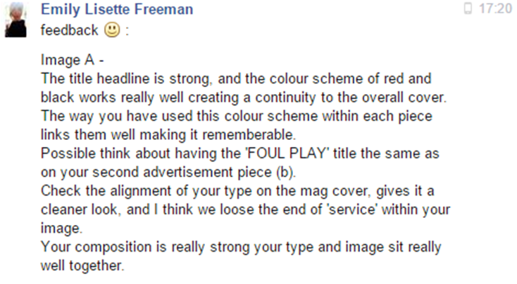
From this feedback I will change the image so that it fits my genre more as the consensus of this feedback is that it doesn’t suit the horror genre. I will also minimise the story lines on the left hand side and bring them in as they are too close to the edge. I will also have ‘Foul Play’ in the same format as my poster to embrace synergy in my products. I think I will also have to change the background colour from white to black so that it adds to the chosen genre.
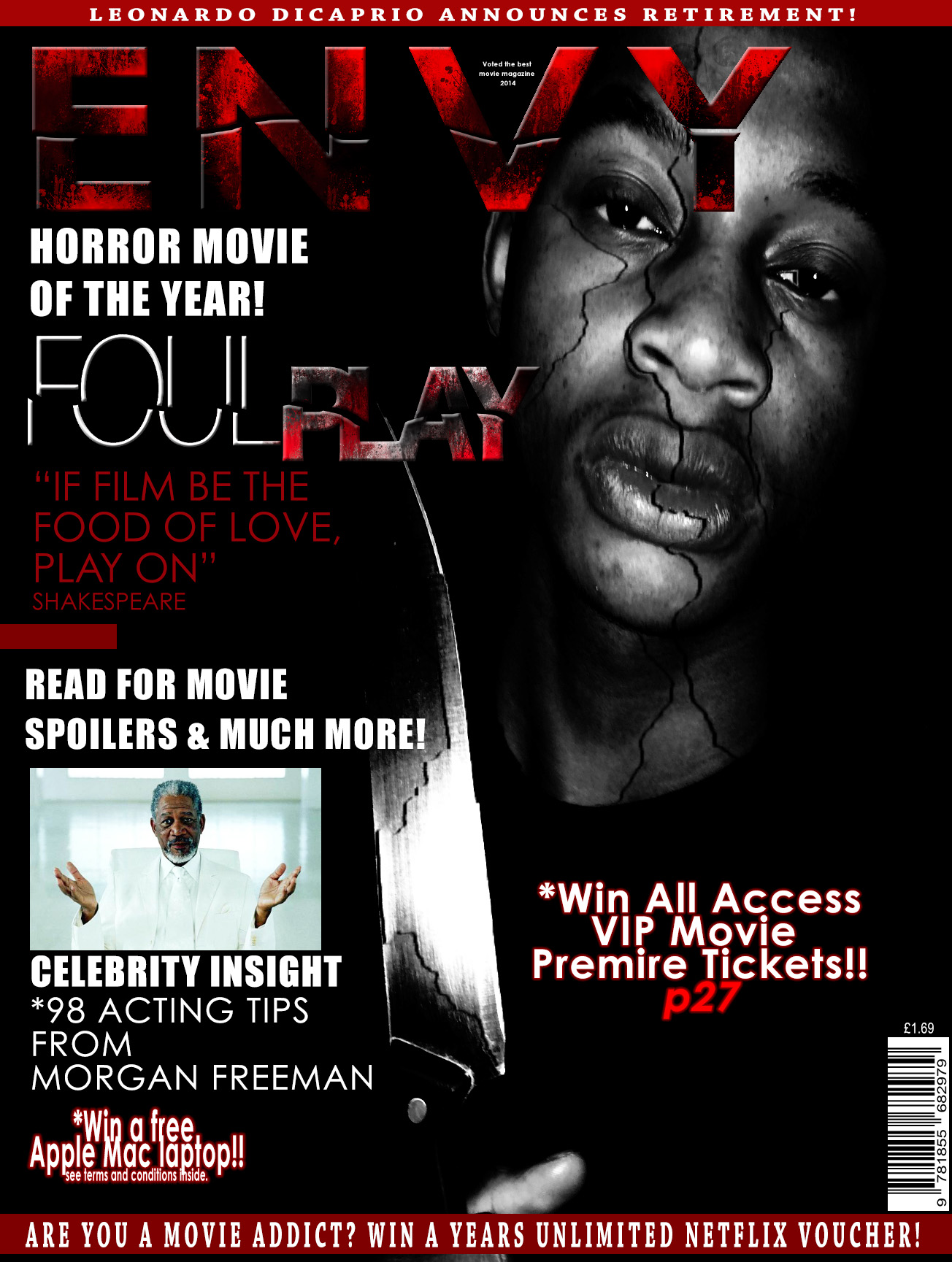
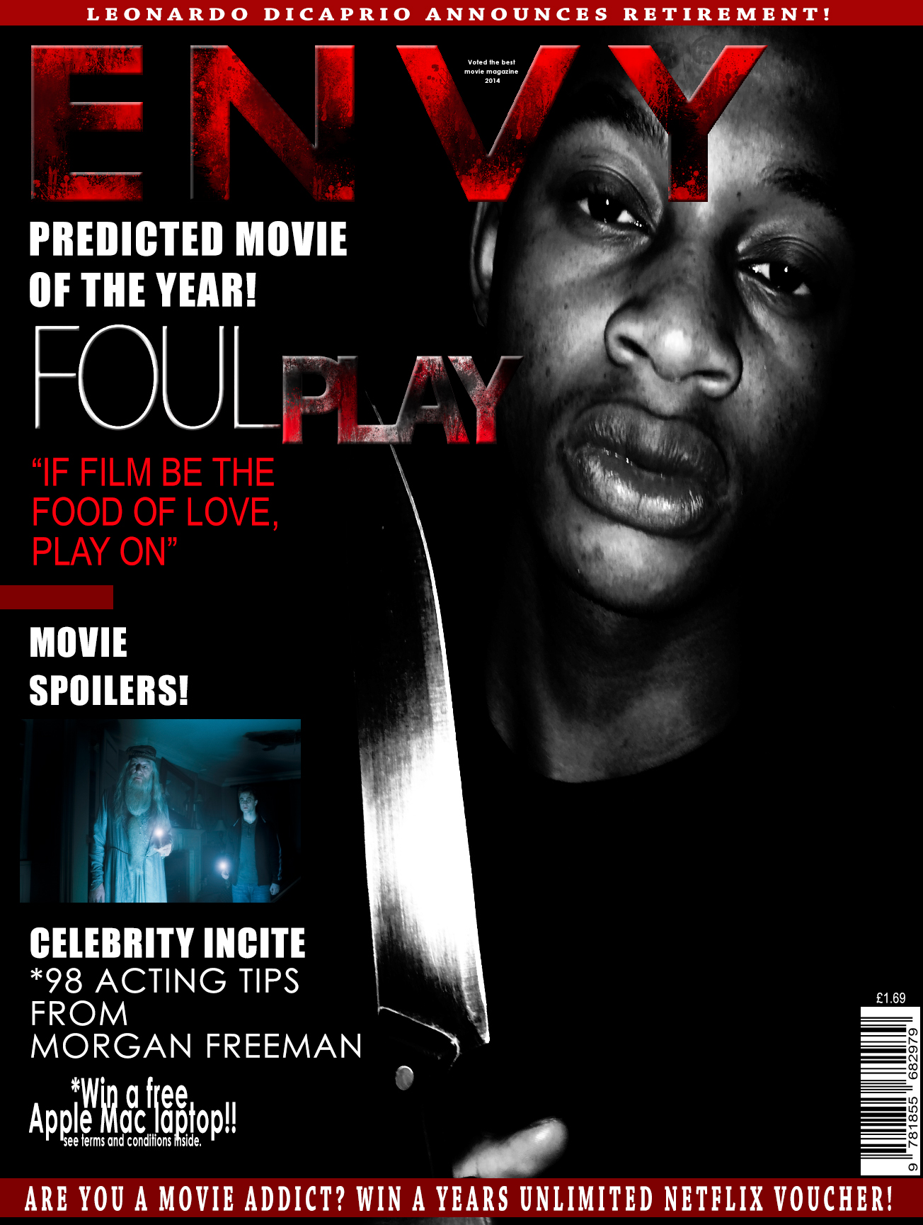 This version of my magazine was the one I changed with the feedback I received. I then asked my lecture to have a look at it and feedback i received from him was the the harry potter picture didn’t have a clear link or significance to the overall magazine so I replaced this image with a picture of Morgan Freeman as he is who I reference below so it would have worked better. Another point was the picture was bland and had no substance, i needed to make it more distorted and more sinister. Also the right side of the main image needed to be filled so I added a competition. This was the outcome.
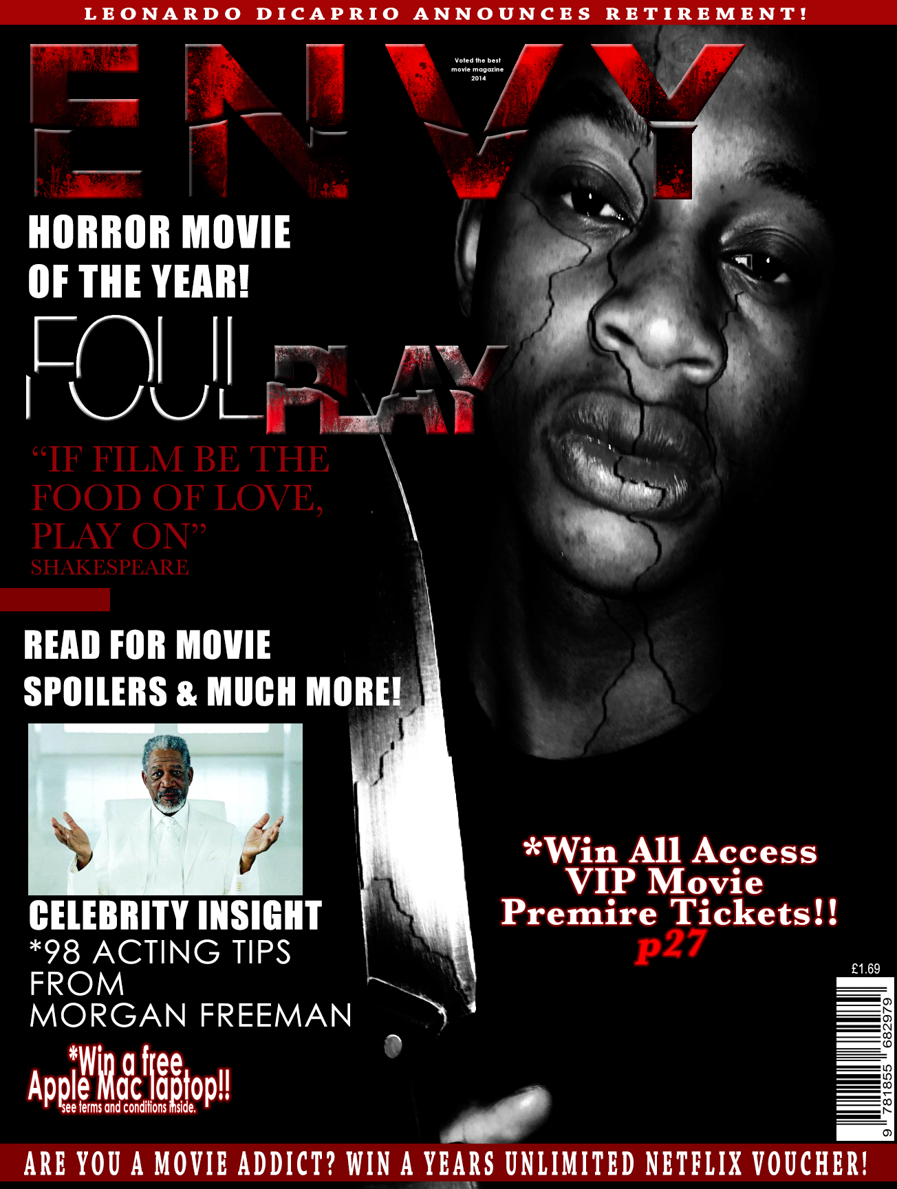
For the cracking affect on the face, and titles I used the lasso and quick selection tool to select the piece I wanted to crack and I then clicked onto the move tool to move the selected part from the original image giving a cracking affect. This also worked for the titles.
Market Synergy
I used the same ‘Foul Play’ title image on the magazine as on my poster to incorporate a synergy. The style of my poster with a black back ground with a black and white image is also synergy. I also used the same colour scheme of white, red and black to keep the market synergy a constant theme through my work.
*To export all Photoshop documents you have to change the file format from PSD to JPEG as this is a generic file format.
