My group and I have been using social media site Facebook to communicate with one another. He’re we were able to create a group message where we could send each other important dates for filming and editing, we could send each other material to go on each others blogs like pictures, sound bits, video’s and general communication on how we are going to progress with each part of the project.
Along side Facebook we have used other means of communications such as phone calls and texting, for a more faster response method.
Communication is crucial whilst working within a group and that is why it was a high priority when thinking about responses and keeping up to date with the messages.
In this post I will be illustrating the processes I took in order to complete my magazine. To start of with I used needed to do some research on magazines and layouts. I realised this was a main focus on my AS Media Coursework last year so I visited my old blog and used some of the research I had already collected. This has saved me a great deal of time!
Magazine Conventions
When constructing my magazine features I will need to include so my magazine front cover is generic are the following:
A banner (promotional features are an option)
Masthead (usually the name the magazine)
Main image (so people can have a tease of what content the magazine will feature)
Cover lines
Strap lines
Footers
Barcode
Price
website
serif font
A clear colour scheme
Issue number and date
Banners and mastheads are usually positioned horizontally on the top third of the magazine. Headlines and cover lines are usually positioned on the left third of the magazine so if the magazine is covered by other magazines the audience can see the main stories quickly by only seeing a third of the magazines. The barcode is usually found on the bottom right of the magazine. The image is always in the middle of the magazine left of right third; depending on the image size and the editors preference. The purpose of this is to grab the audiences focus.
The above is my primary research from last year. Although last year I designed a music magazine the layout and conventions would be the same for all genre magazines.
I will now collate a few examples of current horror movie magazines that are out there already so I can have examples to work from.
I started the process last time with making a flat plan so that’s how I started again this year as it is good for guidance. Below is a flat plan of the layout of my magazine front cover.
For the actual creation of my magazine I used the programme Adobe Photoshop. I was an amateur at using the programme so I watched a few youtube video’s to guide me thought the basic features of the program. The videos I watched are as follows.
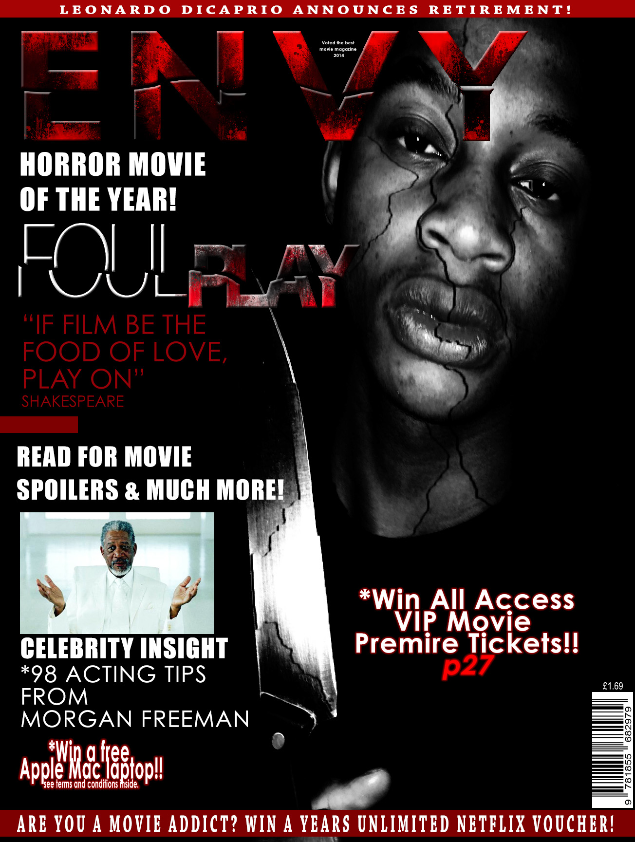
Every magazine needs a Masthead so that is what i started with when making my magazine. I decided to call my magazine ‘envy film’ because I want the audience to be ‘envious’ towards the stars that feature in the magazine. I want them to gain inspiration just from reading the stories inside. I added ‘film’ to the name to emphasise the genre of magazine it is. Here are the steps I took to create my masthead.
Masthead stage 1.
Masthead stage 2
Masthead stage 3
Masthead stage 4
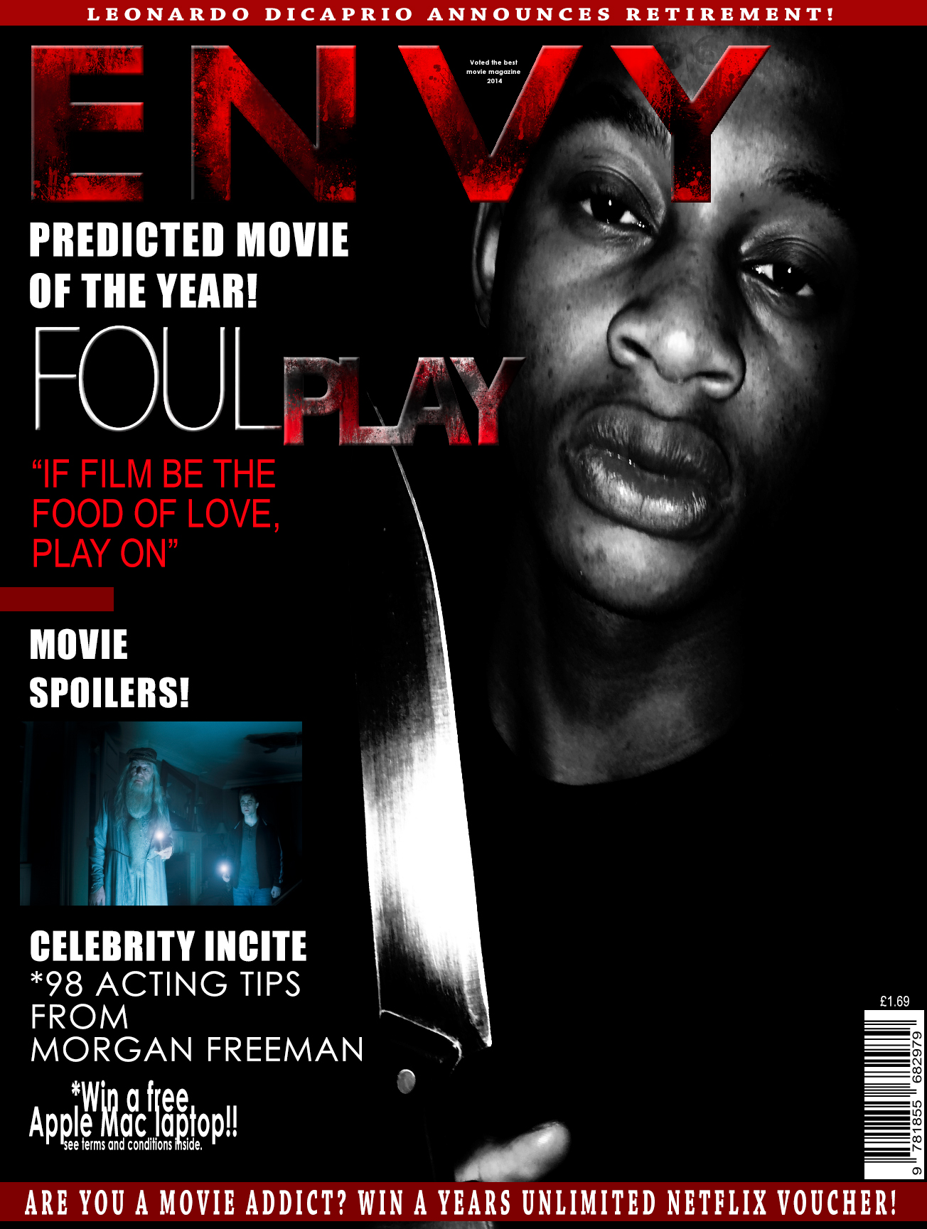
From here them began to construct some generic magazine storylines that would entice the readers, I also added puffs and pugs with competitions on them. I inserted a strap line on the top and the bottom of the magazine and I also inserted a barcode. This was my first draft. However I know I need to include a main image so this will be my next focal point.
The picture below I added a main image on my magazine. It is of the main character in the film. This is the synergy to my poster and film trailer. As before I didn’t have a main image I couldn’t see the spacing betweeen my masthead and the main image, so here I have removed the FILM and the stars below the mast head ‘ENVY’ as it was an element that didn’t work.
For this magazine front cover I went on Facebook (a public social networking site) so that I could get general feedback from the public here is the feedback that I received:
this was the post I wrote prior the feedback.
From this feedback I will change the image so that it fits my genre more as the consensus of this feedback is that it doesn’t suit the horror genre. I will also minimise the story lines on the left hand side and bring them in as they are too close to the edge. I will also have ‘Foul Play’ in the same format as my poster to embrace synergy in my products. I think I will also have to change the background colour from white to black so that it adds to the chosen genre.
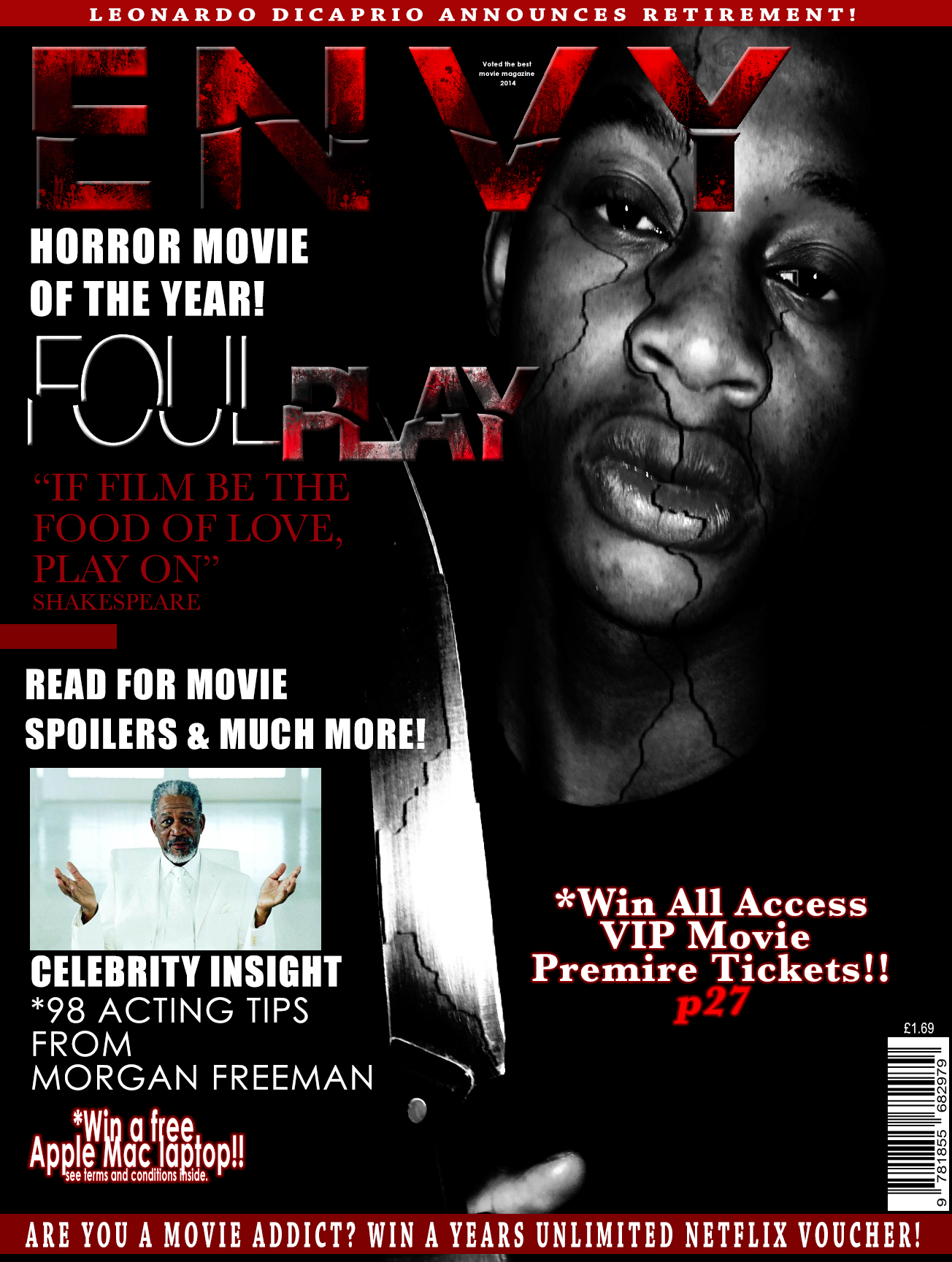
This version of my magazine was the one I changed with the feedback I received. I then asked my lecture to have a look at it and feedback i received from him was the the harry potter picture didn’t have a clear link or significance to the overall magazine so I replaced this image with a picture of Morgan Freeman as he is who I reference below so it would have worked better. Another point was the picture was bland and had no substance, i needed to make it more distorted and more sinister. Also the right side of the main image needed to be filled so I added a competition. This was the outcome.
For the cracking affect on the face, and titles I used the lasso and quick selection tool to select the piece I wanted to crack and I then clicked onto the move tool to move the selected part from the original image giving a cracking affect. This also worked for the titles.
Market Synergy
I used the same ‘Foul Play’ title image on the magazine as on my poster to incorporate a synergy. The style of my poster with a black back ground with a black and white image is also synergy. I also used the same colour scheme of white, red and black to keep the market synergy a constant theme through my work.
*To export all Photoshop documents you have to change the file format from PSD to JPEG as this is a generic file format.
To follow my trailer I had to create some advertisement in the form of a poster and a magazine front cover. In this post I will illustrate the procedures I took in order to create a final poster.
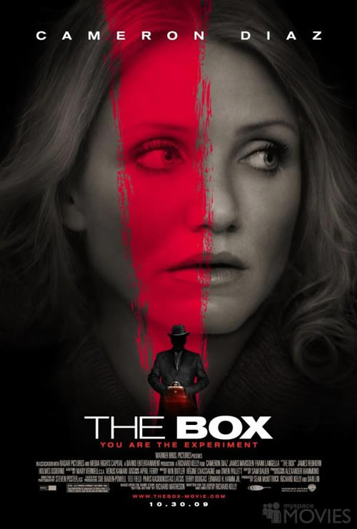
First of all I used my previous research and collated the three poster I had already used in my pre – production stage of my project, where I analysed posters of Sinister, Black Swan and The Shinning.
I noticed a running theme on all posters are there is a main image of a character that features in the film, there is some sort of distortion in the genre psychological thriller. Lastly the layout is generic to a typical poster with the main image, credits on the bottom third, and some sort of quotation on the poster (puffs and plugs). To make my poster as best as it can be I had to follow these conventions. I started off with choosing a masthead. In these three examples the name of the movie is the mast head so for my poster I decided my masthead would be ‘Foul Play’ (the name of our movie).
To create this poster I have been using adobe inDesign. I tried to find a font that was effective and that made my poster look professional. However none of them fit my criteria so I decided to go on the internet and use DaFont a website that allows you to create certain fonts.
This website allowed me to chose from a wide range of fonts, I went through all of these font types and came down to a list of my favourites:
I put these in an inDesign document to see if they fit the look I was going for in my poster.
1.
2.
3.
4.
5.
After getting feedback from a few class friends and class lecture I collated responses. The majority said that all the fonts were good for a psychological thriller but they were very generic of the genre. I was told to make find a font that was of psychological thriller based but specific to my trailer so then it is more emphasised. Although from the 5 fonts above the majority of people thought that number 4 was the best out of all of them currently.
In response to this feedback I went back onto daFont and looked for more theatrical/psychological/horror based fonts to fit my trailer. These were the results I got –
I then realised that these didn’t fit my poster either. I wanted something pain but very effective. So I dedicated a few hours to work out how to use photoshop effectively so I could use font’s on the programme and edit them myself to fit my poster.
I began by watching a few YouTube video’s for basic tutorials
This video helped me make custom paint brushes to add effects to my title.
I mainly used this channel as it had plenty of video’s of how to manipulate images which was very important for me creating this poster.
After watching these video’s I began with selecting a main image. This would be my background and after choising this I was under way. Below is the picture I stared with –
at first I could work out what to do to it then realised I need to work with above the characters and also below.. I stated with adding the heading, from there I added a black strip under the heading to break up the picture to the title. This was the out come –
I then realised there was no horror/psychological implications to emphasis my trailer so I went generic and added some blood. This picture I found on Google.
With this picture I had to edit is so the picture fit with my main image. I done the editing on a different tab. I removed the background (white) and the blood that was on the white to be just left with the dark red edged on the left. The picture below will show
I then had to copy this image and paste it onto of my main image as a layer. This meant I had to scale and rotate this image so it fit properly. I had to also arange my layers so you could still see my title heading.
From there I didn’t like the texture and contrast between the new layer on my main image so I thought to mess around with photoshop and I found an option that allowed me to change the colouring of the blood layer. This was on image > adjustments > curves. A box would appear and I just moved the line around to change the colour of the picture. This made suttle differences but my poster was beginning to take form.
I then realised I didn’t like how the foul play heading contrasted against the rest of the poster so I double clicked the layer and a layer style came up. I could adjust the title to my preference. Again I had to have a little play around until I came to something I liked. I changed the blend mode from normal to saturation. I then copied the layer and made it an overlay. This was the out come.
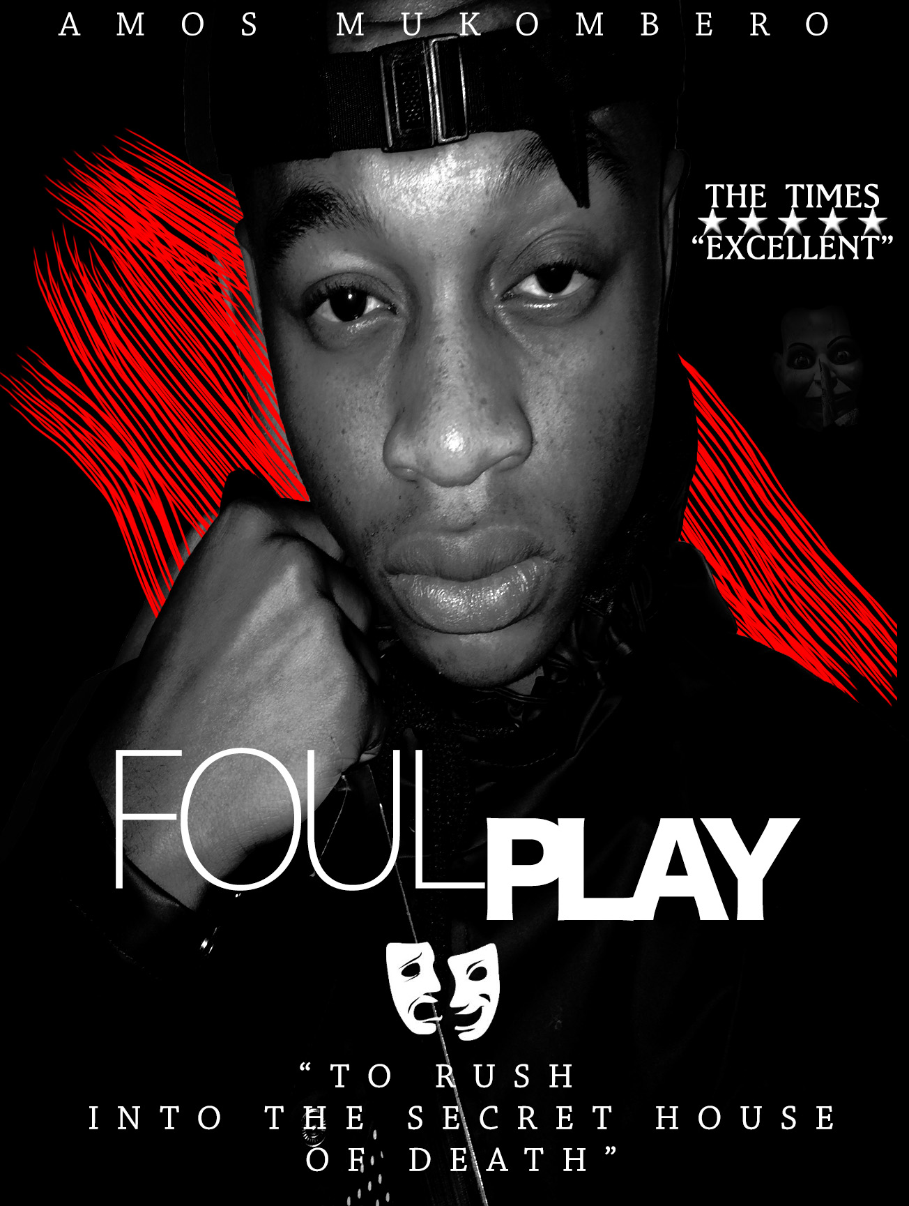
Most psychological posters have a mystrious hidden picture* so I added this to the corner. Editing this picture I had to select the part of the picture I wanted like I done previously for the blood, then from there I had to adjust the layer style as I did with the header. I decreased the opacity from 100% to 28% making it less visible giving a eerie feel to it. As if it is hiding away. As our trailer is a theatre based trailer I also thought to incorporate generic theatre masks somewhere in the poster and a picture of Shakespeare as he was iconic in our trailer. As a game – spot shakespeare (clue look at the actors) .With the masks I changed the blend mode from normal to saturation to match my title. I found that the best place was in-between the foul and play on the title. Below are the two pictures as originals and how I changed them to fit my poster.
After incorporating these images in my poster I thought I had a finished piece that looked like the picture below. How ever I wanted to maximise my poster and make it the best it could be so I went around the class to get feedback.
General feedback I got was I needed to add in some sort of quote, I needed credits. I needed to lose the Shakespeare on one of the characters faces as it doesn’t work. Other feedback I got was I need to change the main image and make it more audience engaging, there are no focal points within the poster and this is important for a poster to lure in the audience. Also they said they liked the editing of the header, it seemed as if a lot of time was spent on it so they credited me for that. They also liked the picture in the top right hand corner as it illustrates the genre more. The rating and the theatre masks were also aspect that my class mates liked. To this response my group and I got new pictures they are below.
As these pictures were facial based I done some more research on posters that had a main image of a face to get inspiration from these are a few:
I then kept picture in the top right hand corner, the masks and the rating. Although I reconstructed the title as you can see. And it started to look like this:
From the examples they all have the main actors name above the main image so I decided to add that to mine. I also decided I want to include another colour to the poster and the quote in response to the feedback I received. This was the outcome of all of these changes. The quote I obtained from doing a google search of ‘famous shakespeare quotes about death.
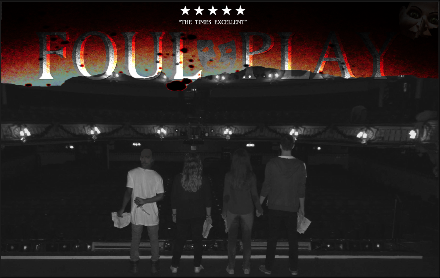
For this movie poster I went on Facebook (a public social networking site) so that I could get general feedback from the public here is the feedback that I received:
this was the post I wrote prior the feedback.
After the feedback I received I reconstructed my poster changing around the playing with the advise I received. An aspect I didn’t include was the mask picture, this was because I found it on another publication that was not my own and including it would have meant that I was breaching copyright rules. Aspects I decided to add on top of the feedback were social networking information on the bottom of the poster, this included the twitter hashtag #FoulPlay and the @FilmFoulPlay for Facebook and Instagram. This would embrace advertising for the movie.
For the cracking affect on the face, and titles I used the lasso and quick selection tool to select the piece I wanted to crack and I then clicked ono the move tool to move the selected part from the original image giving a cracking affect. This also worked for the titles.
The fonts I used to create my final poster were Baskerville
Market Synergy
I used the same ‘Foul Play’ title image on the poster as on my magazine to incorporate a synergy. The style of my magazine with a black back ground with a black and white image is also synergy. I also used the same colour scheme of white, red and black to keep the market synergy a constant theme through my work.
*To export all Photoshop documents you have to change the file format from PSD to JPEG as this is a generic file format.
Today we started the editing process of the project. We uploaded all of the footage from the DSLR to the Apple Mac in order to use the programme premier pro for editing. Jemma took the lead for this process as she is a photography student she has more experience at using the programme more than Eleanor and I. After we uploaded all of our footage we encountered a problem and that was we had a lot of footage to go through and check before composing the trailer. So this editing session comprised of going through the footage and begin the composition.
This editing session was successful, in the sense that we have started making the trailer and we have realised we have to make an extra filming sessions to fill missing parts of the trailer as we could not check the footage thoroughly when we were filming in the first two sessions.
Following the last filming day last week we looked at the footage on the camera and noticed we were missing a few camera angles and shot types for certain scenes. So that was what we focused mainly on today. Basically we re-shot the scenes we filmed last time but instead we filmed it using the different types and angles. For example there is a chasing scene where the shot type is a over the shoulder tracking shot but today we filmed from the top of the steps (high to low shot) and a still (low to high shot) from the bottom of the steps. We realised the different shot types contributed different settings.
Beneficial, this day was productive as it meant that we had more footage to play with in the editing stage of the project. However this does not mean this is not the last day, if more shots need to be taken then we will have an extra day to film.
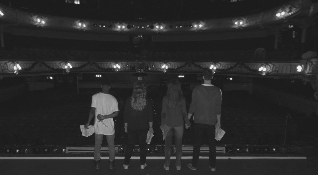
Today we returned to The Kings Theatre, we briefed everyone again and got straight under way with filming the main scene’s. Those included finding the box in a small cupboard in a secret room. We also got shots of the actors going into the theatre. Shots of a chase between two characters and eerie establishing action shots and many other shots.
The outcome of this day was productive we got a lot of quality filming done. For example we had the main body of filming done. The problems we had for today was we couldn’t preview all of the shots we had filmed on a screen prior to the editing day so this may mean we have to get more filming done.
Today we had our test filming day which will hopefully prepare us for when we begin our actual filming. What we can plan for today is what parts of the theatre we want to feature in our trailer. Unfortunately we can’t feature everywhere as it is a big venue.
I met the team: Eleanor Wemyss, Jemma Green, Amos Mukombero, Callan Riches, Hayley Newell, Poppy Currie at the front of The Kings Theatre on Albert Road in Southsea at 9am. From there we went to one of the meeting rooms where we could brief the team on today’s events so that everyone knew what they were doing and when.
We then followed the storyboard and attempted to re-tell it live using the theatre.
I think today was useful as we found a place where we would the box with the Shakespeare plays in and we also could take pictures for the risk assessments. We were also able to get clear establishing shots which will mean we wont have to waste time on actual film days.
Risk Assessments are a key part of managing a business as they help to ensure the safety and health of all employees and customers.
Regulations state that, by law, you must carry out a risk assessment unless there is fewer than five employees. Though many companies will carry one out anyway, to lower the risk of injury. There are also regulations in place for young people (over school leaves age of 16 but below the age of 18) which must also be considered.
In our project there is little risk to cast and crew as we have not selected a high hazard location, nor are we using hazardous equipment.
(table created by the director Eleanor Wemyss, picture evidence and additional writing by myself (Jemma Green)
This PDF document consists of our risk assessment.
To ensure our safety whilst filming we were given a safety talk at the beginning of the day and had a member of theatre staff with us at all times to supervise and ensure our safety.
The purpose of a teaser is to ‘tease’ the audience. Showing minimal dialogue and footage of the movie although this is optional, footage from the movie does not have to be features. Usually a teaser is a minute long, sometimes longer. It is released about 18 months before the expected movie premier. Used to build anticipation for the expected target audience, it is an enigma used to puzzle the audience making them want to watch the movie when it comes out. A teaser is an advertisement of a movie, presented in cinema’s, on-line or television before feature movies. The construction of a teaser is a few flashed images or very short video clip closed with a title card showing the date of when the movie will come out. Viewers usually recognise the images and try and solve puzzle. Teasers work best when they are for films in a series as the audience will recognise symbols and faces.
This is an example of a teaser trailer of the movie Sinister


![salt-2[1]](https://amosmukomberoa2media.wordpress.com/wp-content/uploads/2015/02/salt-21.jpg)


